What is a Responsive design?
Responsive design by the terminology means a dynamic or fluid design, which can adapt to any screen size irrespective of the device on which the end user is using the application. One of the key aspects when a customer looks at new application development is the capability to have a responsive design for the application responsive Power Apps Canvas, which helps them to give the end users same experience on a large screen like in a desktop, to a mobile device like in a mobile phone. The need of a responsive design is becoming critical in every customer decision making whether it’s a new custom development or even a platform driven development approach.
Microsoft Power Platform, a low code / no code application platform (NCAP) provides this capability in the rapid application development using Power Apps. The key thing to note is the fact that in a traditional development, such a responsive development would require a good amount of work from a UI/UX engineer working in detail using CSS. This approach reduces the time taken for such development.
How to create an new App using Power Apps?
Steps to create App.
- Go to chrome and type make.powerapps.com
- It will lead to sign in, give credentials Email and Password to sign in.
- Once you login in left hand side you can see different options such as Home, Learn, Apps etc.
- Click on Apps.
- Once you click on App on top you can see New app option.
- When you click new app, you can see 3 options such as Canvas, Model-driven and Portal.
- Select Canvas
- It will lead to new tab where you can find 2 options for creating app (Please refer below screenshot).
- Phone Layout and Tablet Layout in Blank App (you need to insert all controls)
- Phone Layout and Tablet Layout in Template App (prebuilt templates will be given you can modify)
- As we are building Responsive canvas app, please select Phone Layout as your preference (Blank or Template).
- For more detailed information on creating app please refer: https://docs.microsoft.com/en-us/powerapps/maker/canvas-apps/get-started-test-drive

Power Apps has provided some new features enabled to make an app responsive. We need to follow below steps.
- Once you create app you can find on top menu you can see File, Home, Insert, View, Action.
- Click on File.
- On left menu click on Setting
- You can see one more menu list beside left menu.
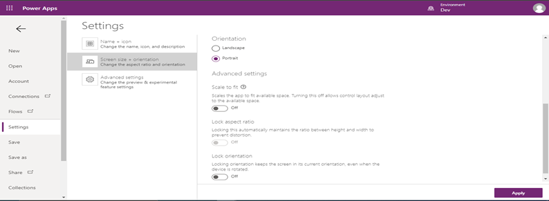
- Click on Screen size + orientation.
- Beside one more screen visible as shown in the below screenshot.
- Off the Scale to fit, so that your app will fix to whichever window size.
- Off the Lock orientation, so that it will not affect while your mobile rotation will be done.
- To save the changes click on Apply and save the app and publish.
- How to add screen and form?
- To make the Form we are creating responsive, we need to follow below steps.
- Click on Home option in top menu.
- Click on New Screen
- Click on Insert option in top menu.
- You can see all different controls such as gallery, form, button, input etc.
- Click on Form, you can see 2 options.
- Edit
- Display
- Select Edit Form
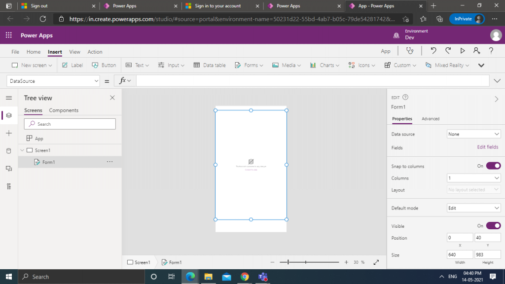
Once you insert form you can see as shown in below screenshot.
How to configure form
How to configure form?
- You can find on right side Property name called DataSource.
- Click on dropdown of DataSource.
- You will get list of entities (Tables), you can select for which entity (Table) you want create form.
- Once you add DataSource, below Datasource property you can see Edit fields.
- You can select fields of form which is required.
- In below you have one more property called Default Mode
- Select Default Mode as New for the new form.
- In form on left side, you can see Tree View.
- You can see inside form DataCard.
- In DataCard you will be having 4 controls
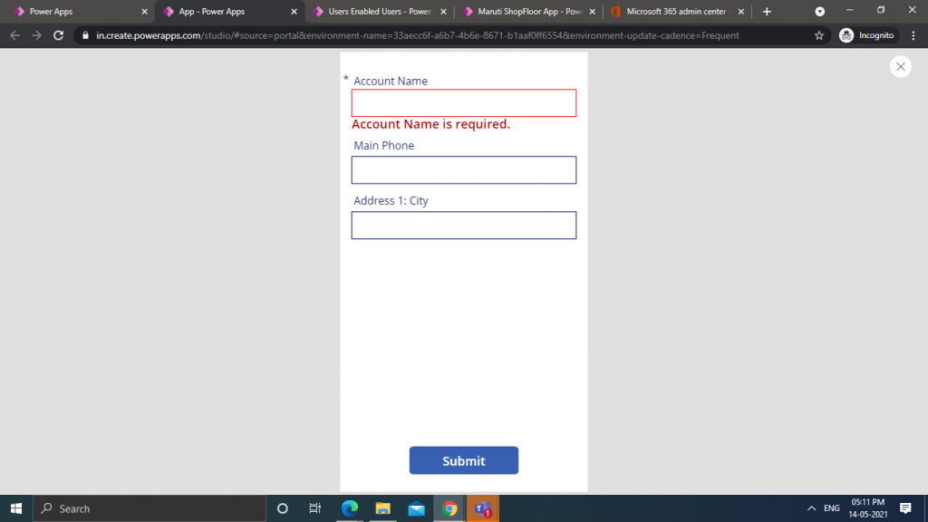
- StarVisible – If the field in form is required then star will be visible.
- ErrorMesssage – If the field is mandatory, without filling this field if you try to save, then error message will be shown.
- DataCardValue – It is used to enter the data by end user (Depends on datatype)
- DataCardKey – Name of your field which you have entered in your table.
You can see below screenshot how it displays if you try to submit form without filling detail which is mandatory field.
How to make the form as Responsive?
- Set Columns to 4 (So that we can see 4 field in single row for browser)
- Set form width property as Parent.Width (Note: Width will automatically adjust to browser or mobile width)
- Set form Height property as Parent.Height (Note: If give Parent.Height it will set to screen height, in below image I have given Parent.Height-250, so that we can place Submit button below)
- Select Datacard of your form.
- Set DataCard Width property as Parent.Width./App.ActiveScreen.Size
- Set DataCard Width property to all DataCard. (You can use Ctrl+A to select DataCard at a time)
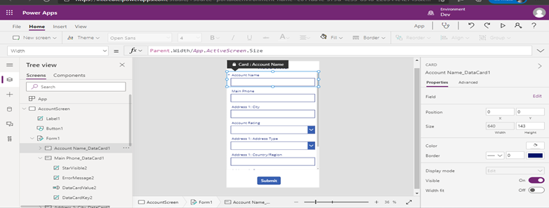
Once you done with above steps you can see your form as responsive.
- The below screenshot shows your mobile app while playing it will set to browser width.
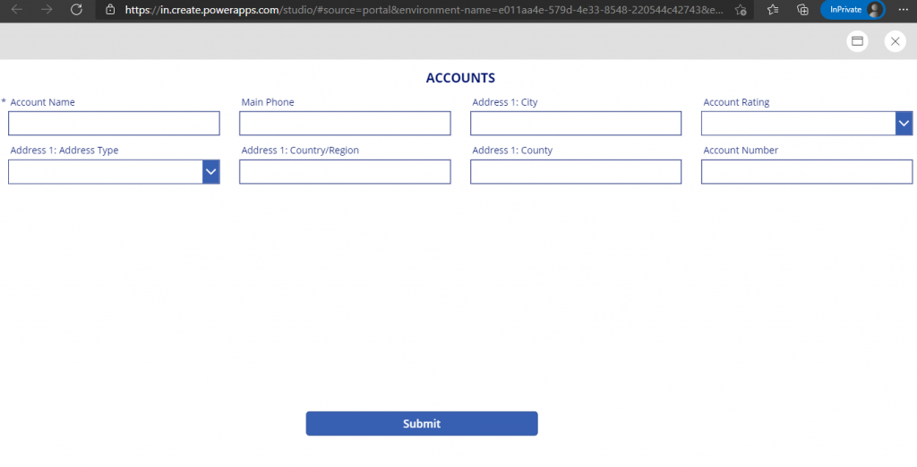
If you reduce to half of your browser, then the form will automatically adjust to your browser size.

If you reduce to Mobile size your browser, then the form will automatically adjust to your browser size.
Blog authored by Jeniviya M., Power Apps Consultant at Sysfore Technologies.
Also Read More about – Power Apps Platform
You can talk to one of our solution experts today to learn more about you can leverage Power Apps and the Power Platform in your organization.
Sysfore is a Microsoft Gold Partner with unique customer stories using the Microsoft Power Platform. Being a low code/no code platform, partner could help customer in quickly building apps for their key business challenges leveraging the various solution components. As requested sharing with you the solutions which Sysfore has already built on Power Apps platform for customers.
Get Sysfore Cloud Managed Services For Your Enterprise
Sysfore, A Microsoft Cloud solution provider and a Gold Partner, uses leading network, technology, and service expertise to deliver our service anytime, virtually anywhere, quickly and efficiently. We have helped over 80 small enterprises and 30 mid-sized enterprises across the globe for a successful cloud migration in the past 8 years.
Contact one of our experts today and we will help you find the perfect solution for your business. Write to us at info@sysfore.com or give us a call at +91 (80) 4110 5555.

